Tech
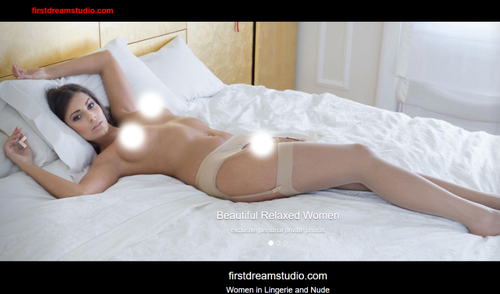
FirstDreamStudio has apparently kept the member’s browsing experience in mind when they planned the design and layout of their page, and that’s something we truly appreciate. It’s always been an eyesore how some porno sites take the time to make their site extra fancy and complex while compromising the visitor’s whole browsing experience. And a first impression always does wonders to aspiring porn sites. There are no menu bars found on top of or at the left most parts, but instead, a short slide of pictures of the models looking cozy and beautiful in their lingeries that take up most of the upper corner of the home page. The black back drop topped with white print, we found, was actually more pleasing and rather neat and orderly with the hyperlinks in red which made everything easier to navigate.
There are no series of videos, or in the case of FirstDreamStudio, a gallery, but instead they have generously given a couple of pictures in high quality as a taste of what is inside and waiting for the members and future subscribers of their site. Each month they feature a model and they showcase one of their best photos to visitors and turn them into members without giving everything away. FirstDreamStudio also boasts an exclusive content. This actually proves to be a deal breaker for some as they prefer their materials in the freshest sense and something that isn’t already strewn around for the internet users to see. FirstDreamStudio in their landing page also added a terms and condition segment where they clearly state that adults that are 21 years of age and over are allowed to continue and click “Enter”. They also made clear that there are prohibited material inside like nudity and explicit content like photos of erotic nature and topics that may be disturbing or offensive to other individuals. We may be over 21 years old but hey, you will never hear us complaining for seeing nudes!


